top of page

Identity x Branding x Illustration x Web
A BETTER LIFE FOUNDATION
As a non-profit organization dedicated to providing food security for North America's most at-risk communities, ABLF wanted to keep their visuals functional and accessible for audiences of all capabilities. Having served more than 3 million meals in Vancouver, Toronto and New York since 2013, their need for a comprehensive set of brand assets paralleled the expanding nature of their programming.


CONCEPT
During discovery and onboarding, much inspiration was found in ABLF's grassroots personality. Featuring this spirit at the heart of a light strategy and brand components was a no-brainer to distinguish them in the non-profit sphere among high-level donors.
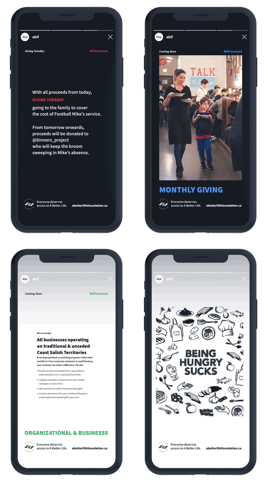
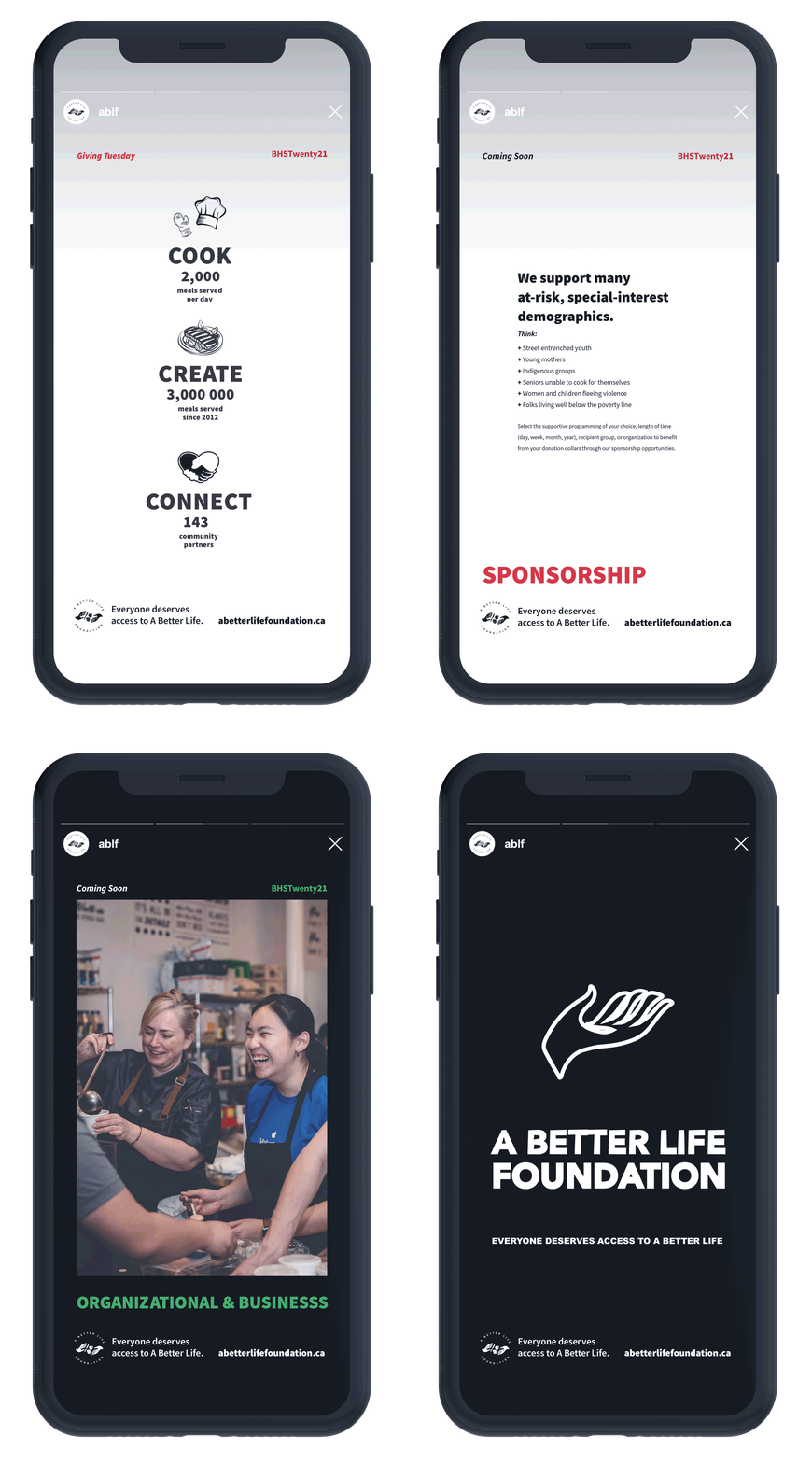
In a style reminiscent of hand-painted street signs and the graffiti culture of urban areas ABLF advocates for, a distinctive system of icons representing food and kitchen-centred tools worked well as organizational elements for data, and dense information. These brand identifiers were paired with fun, bold, clean typography in a black and white colour palette to complete a balanced aesthetic.
Applied to a website build that serves as a primary donation portal and education resource both donors, programming participants and recipients, this identity lives across print and digital.


ABLF programs range from free food literacy sessions and open-invitation DTES dinner events to food waste recovery and inclusive hiring facilitation. These were given secondary, easily accessible identities. Each sub-brand mark is designed to reflect core values underpinning advocacy for and feeding food insecure folks, incorporate elementsof the original logo they wanted to keep, and feel cohesive with new iconography.


bottom of page
